

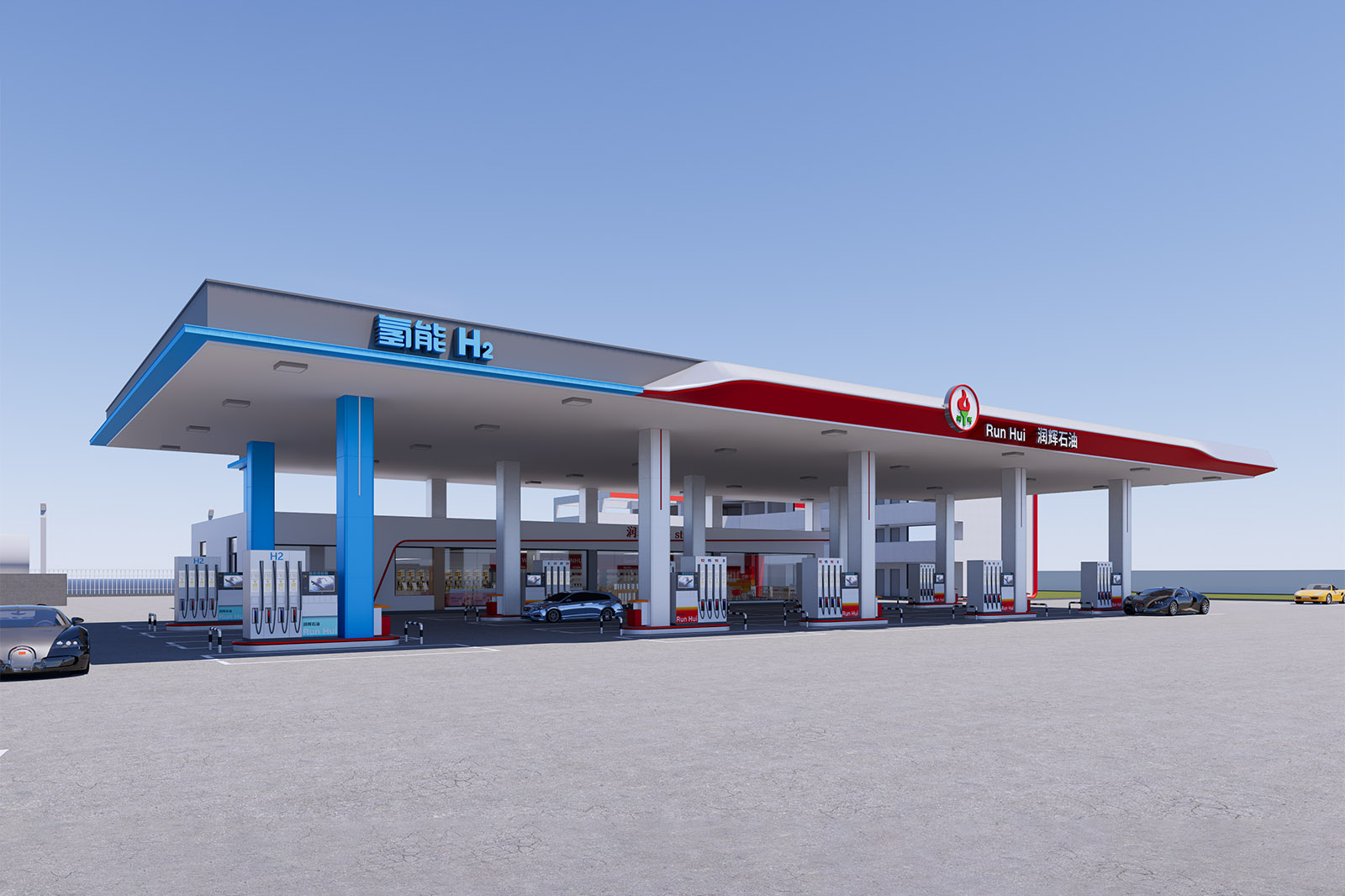
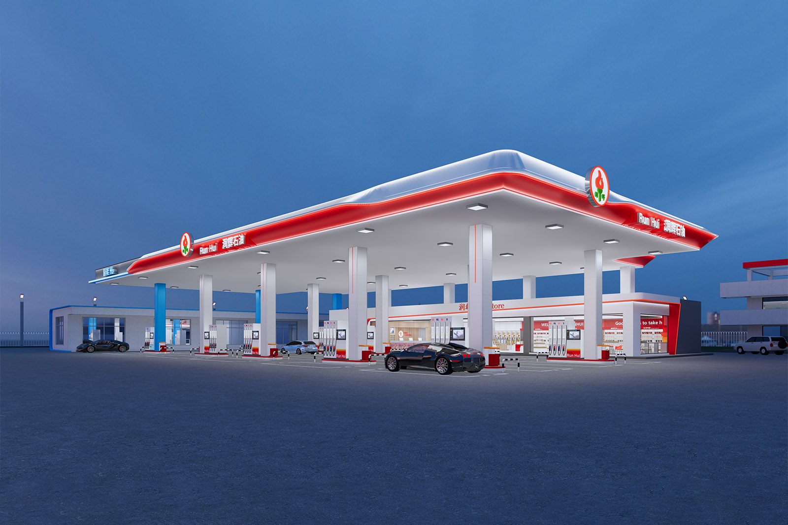
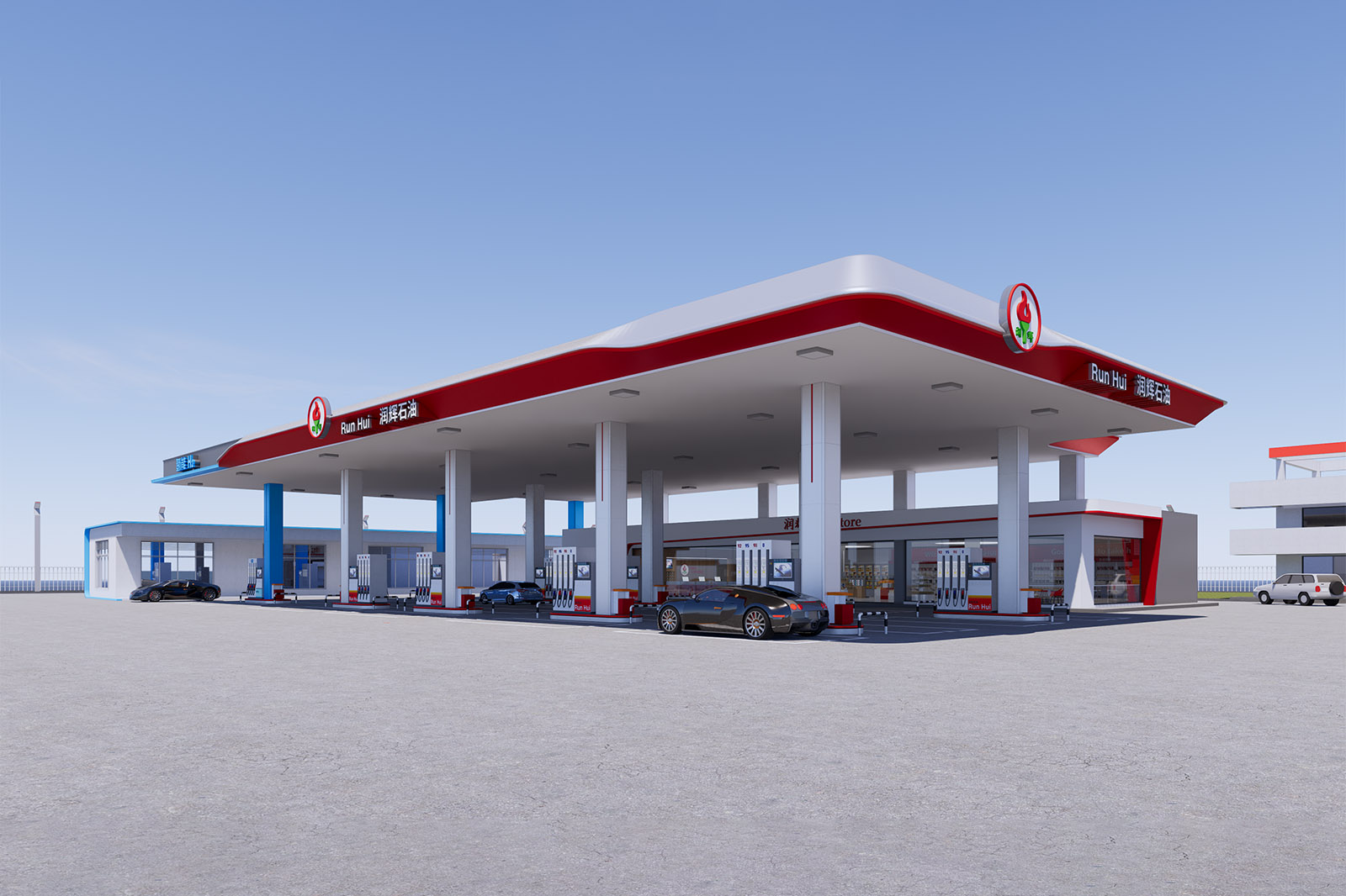
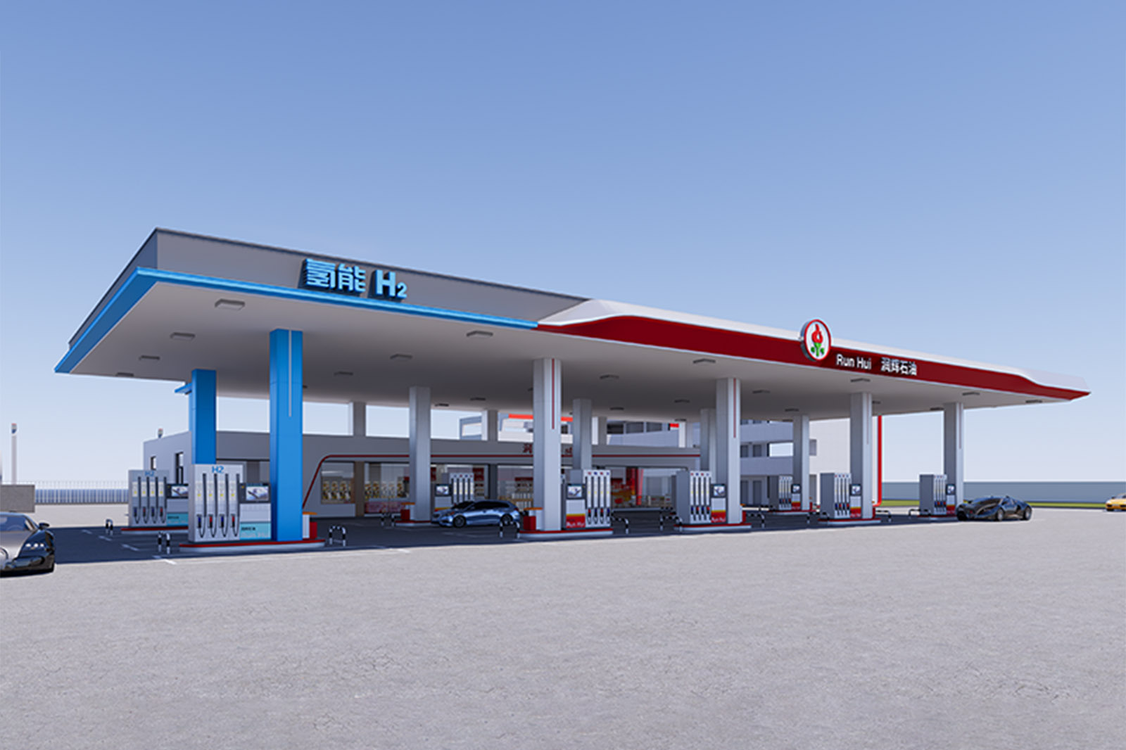
Runhui Petroleum Gas Station
①
01Simple and Powerful, Adapted to the Local EnvironmentArchitectural Form
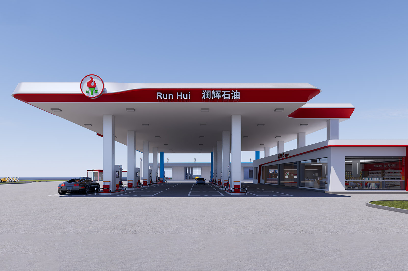
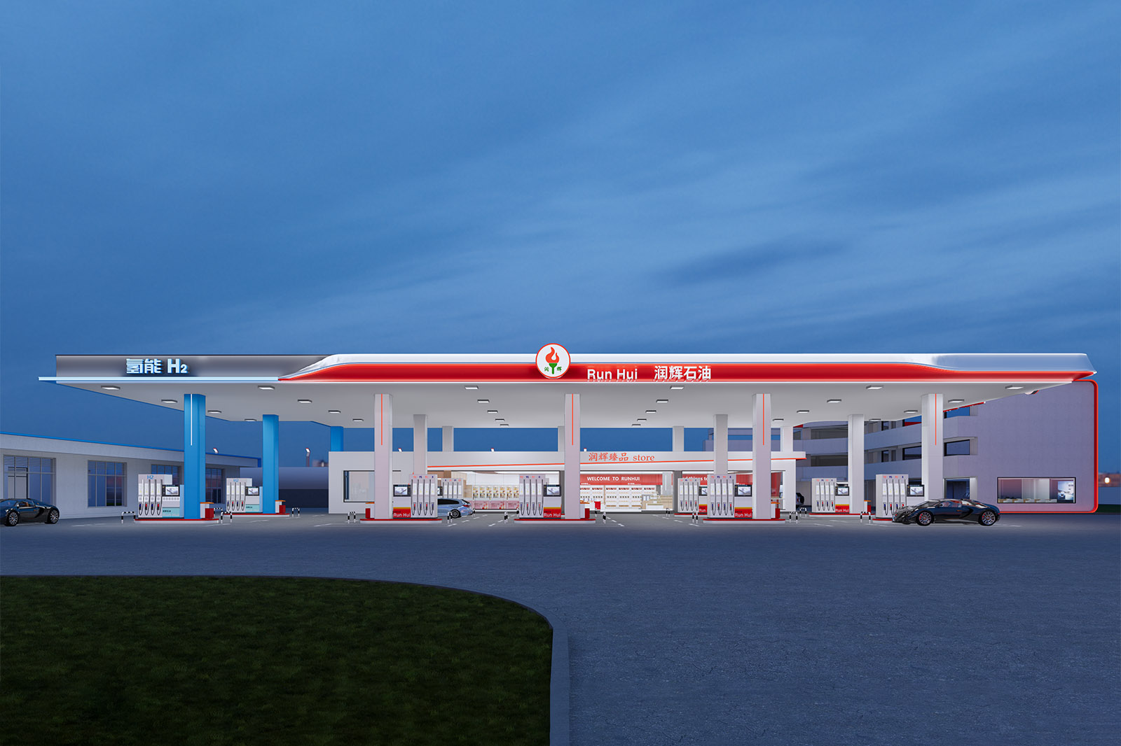
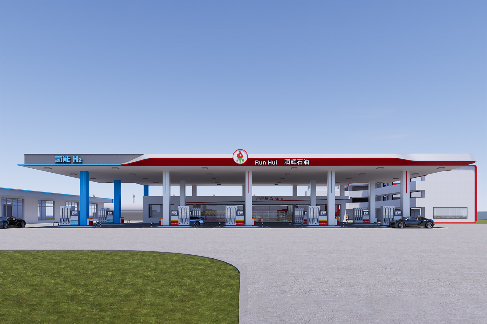
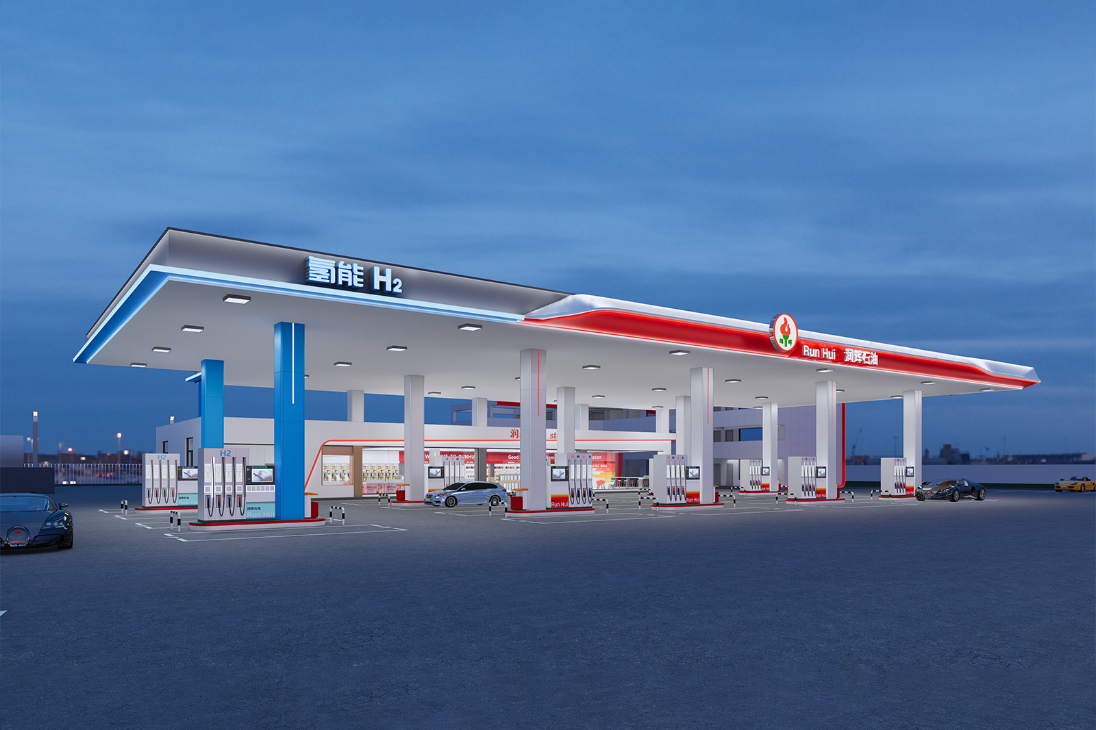
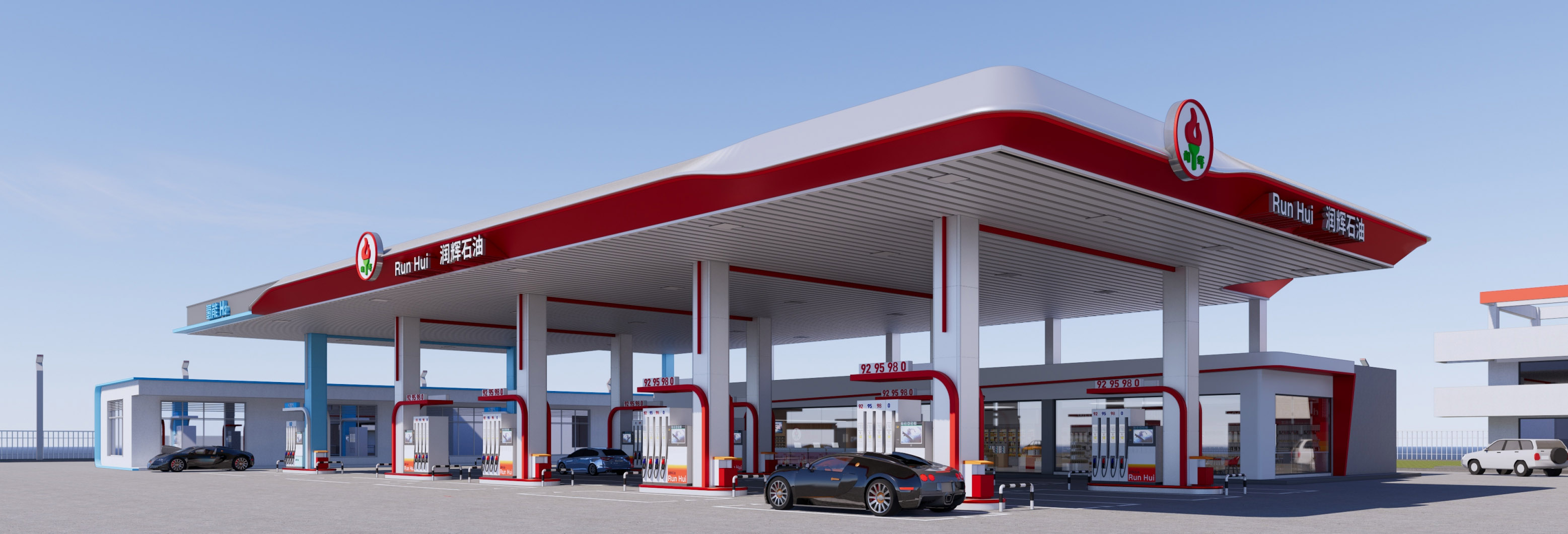
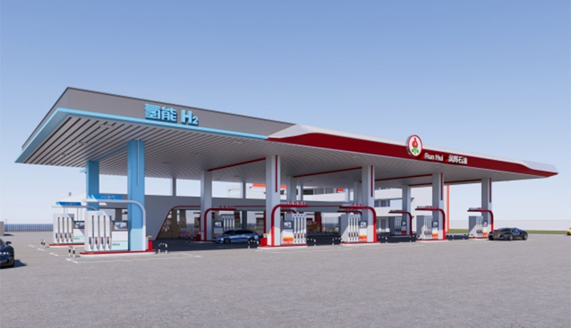
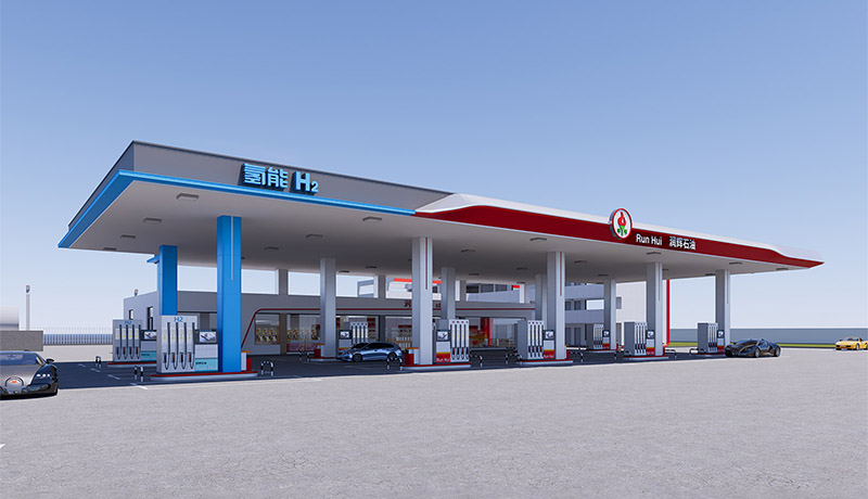
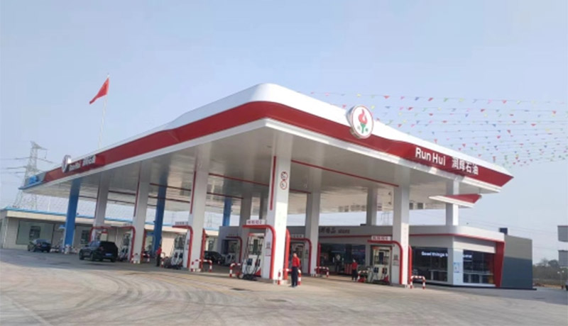
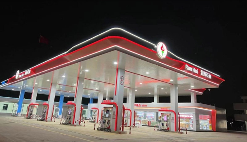
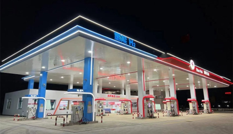
The exterior form follows the principle of "simple yet powerful." The flowing curves of the canopy echo the "swinging and light" rhythm of Foshan's Lingnan architecture, mitigating the harshness of the industrial facility. The red and white color scheme maintains the striking characteristics of the energy industry while also incorporating Foshan's urban color palette (e.g., the red walls of the arcades and the white sails of the dragon boats).
②
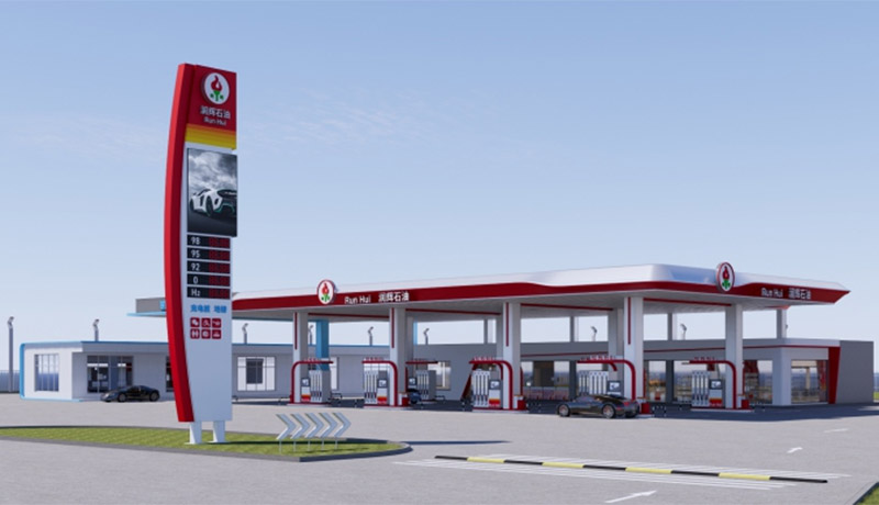
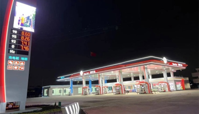
01The towering brand pillar, like a city beacon, integrates fuel prices and service information. It serves as an efficient signpost during the day and transforms into a luminous sign at night, outlining the distinctive "Runhui" silhouette against the city skyline. The gas station seamlessly blends into Foshan's streetscape, becoming a modern statement of the region's character.
A Coexistence of Order and WarmthSpatial Atmosphere
he exterior design balances functional order with a humanistic warmth. The gas station's lanes are clearly planned, with white markings creating a safe and orderly traffic flow, in line with Foshan's urban rhythm of "efficiency first." The digital screens and service icons on the brand pillars convey a sense of technology and convenience, allowing drivers to find a balance between "efficient refueling" and "humanistic care." This upgrades the gas station from a simple energy station to an "energy transfer station" that transmits the warmth of the city, embodying Runhui Petroleum's brand philosophy of "Your satisfaction is my eternal pursuit."
Completed Project Photos
description2
description2